
How game developers pick their fonts
Finding the right typeface can be an exhaustive process, and localization editors don't always get a say when translating games.
After long getting by with the ported mobile versions of the early Final Fantasy games, at last Square Enix announced it would treat PC players to proper remasters. When we finally got a look at the Final Fantasy Pixel Remasters though, what fans focused on in the first trailer wasn't the refreshed pixel art or newly arranged classic songs, but the tragically condensed sans-serif font that left awkward chasms of blank space in menus and text boxes. It was impossible to ignore. A dozen font-replacement mods were online just days after launch.
How does such a small (but clearly vital) decision go wrong? And who actually chooses the fonts that games use?
"It really depends on the game and the team," says John Ricciardi, co-founder of localization company 8-4, who's worked with the likes of Nintendo, Bandai Namco, and Square Enix. "We’ve worked on games where we (as the outsourced localization house) were asked to suggest fonts ourselves, and we’ve worked on games where the Japanese devs had already picked out fonts before we got involved. Sometimes that works out great, and sometimes the fonts chosen are... not the most ideal for the west, and we need to speak up."
Square Enix isn't talking about its peculiar font choice for the Final Fantasy Pixel Remasters, but other developers had plenty to say about what goes into making their text look just right.
Bold choices
"I almost always take the chance to ask if I can choose the font," says Brittany Avery, localization editor previously with XSEED who now works with Nexon. "If they say no, then that’s that, but if they say yes, then I get to have fun!"
What counts as fun for folks who enjoy a good font? Looking at lots and lots and lots of them. You might recognize this brute force method from the last time you were jazzing up the company party flyer or trying to make your resume look just a tad sleeker. And yeah, sometimes it just means going to the font dropdown and hitting the down arrow key over and over again.
"I'd actually take a screenshot of the game, photoshop out the Japanese, and then type a sentence in the text box and go through a thousand or so fonts before narrowing down to the potential ones. Maybe I’d have the perfect one in mind, but if there were a few options, I’d put it to a vote. I’d then give the screenshots I made to the devs as a visual guideline."
Avery has experience localizing games for smaller screens like the PlayStation Portable, but when a game is coming to PC it means more screen space to play around with.
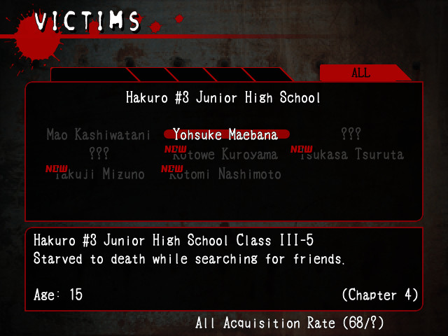
"Legibility is still important, of course, but I think for [PC games], you can also afford to get more creative and bold," she says. One of her favorite font choices was for Corpse Party on PC. In fitting with the theme, Avery really wanted to include a font that would look like coagulating blood. The font she chose for the top of the "Victims" screen in Corpse Party definitely gets that gorey feel across.
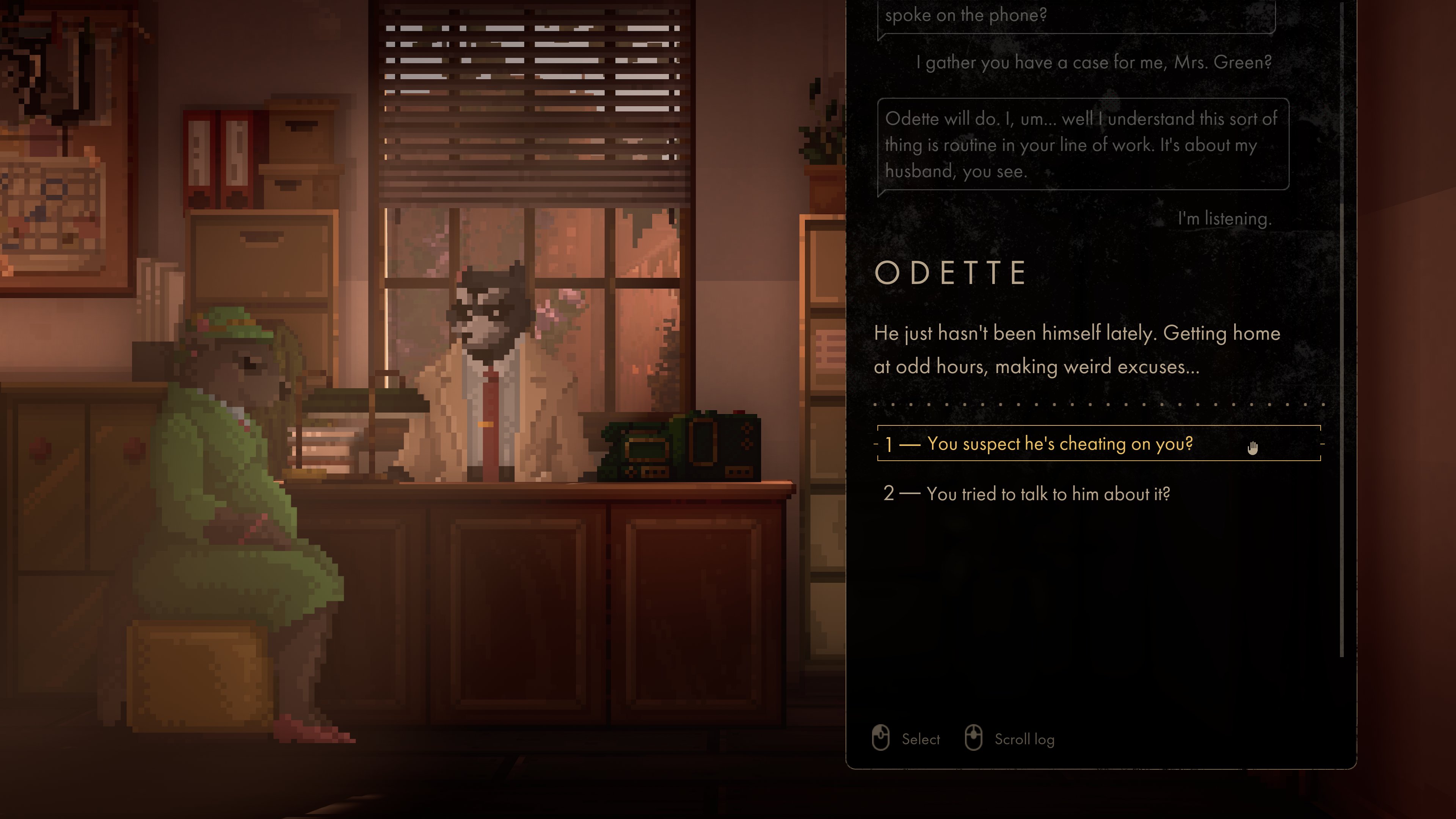
Another bold choice that caught my eye recently was for the raccoon detective game Backbone. After years of showing work in progress, developer Eggnut posted a screenshot of Backbone's new dialogue window that made its text-heavy interface look just as sleek as its modernized pixel art.
"The font had to be expressive, but not too much, so as not to interfere with the player’s reading speed," says Backbone's UI designer Aleksander Kolchin, conscious of how much text players would be hit with throughout the game. "Backbone’s pixel art is a fresh take on the medium that’s very far from the retro aesthetic, so choosing a font was never about evoking a retro feel. Instead, we wanted to emphasize the spirit of the perceived time period when the events of the game take place, which is '50s Northern America."
They wound up choosing Futura, a geometric sans-serif font with bold, simple shapes that gave Backbone's dialogue a clean, minimalist feel.
For a UI designer, the decisions don't end with the choice of a font face, though. You can spot how the speaker's name is formatted differently from the rest of the text. Kolchin says there are a number of other font features to consider when designing an interface: "font size, typeface, line spacing, tracking and kerning, padding and margins, color, visual hierarchy, the presence of other elements, and much more."
Making an Impact
Sometimes a font face also becomes the face of a series. This happened for Avery with the The Legend of Heroes: Trails of Cold Steel, which was localized into English in 2015 and then brought to PC in 2017.
"When XSEED first worked on Trails of Cold Steel, I went through the whole creative process of choosing a font before settling on Cuprum," Avery says. "It was legible, sleek, and the letters were on the thin side, allowing for more space. Nihon Falcom was totally cool with the choice and implemented it into the game."
That may have been the end of a job well done for Avery and for the Cuprum font, but that decision had staying power. Years later, Avery saw screenshots for the English language version of a totally different Nihon Falcom game, Tokyo Xanadu, and there was that Cuprum font again. "I had a good laugh over the fact that Falcom just kept it going," Avery says.
It didn't end with Xanadu, even. You can spot Cuprum in Trails of Cold Steel 3 and 4 and more. "Such a seemingly simple decision on my part has spanned seven games so far... just wild."
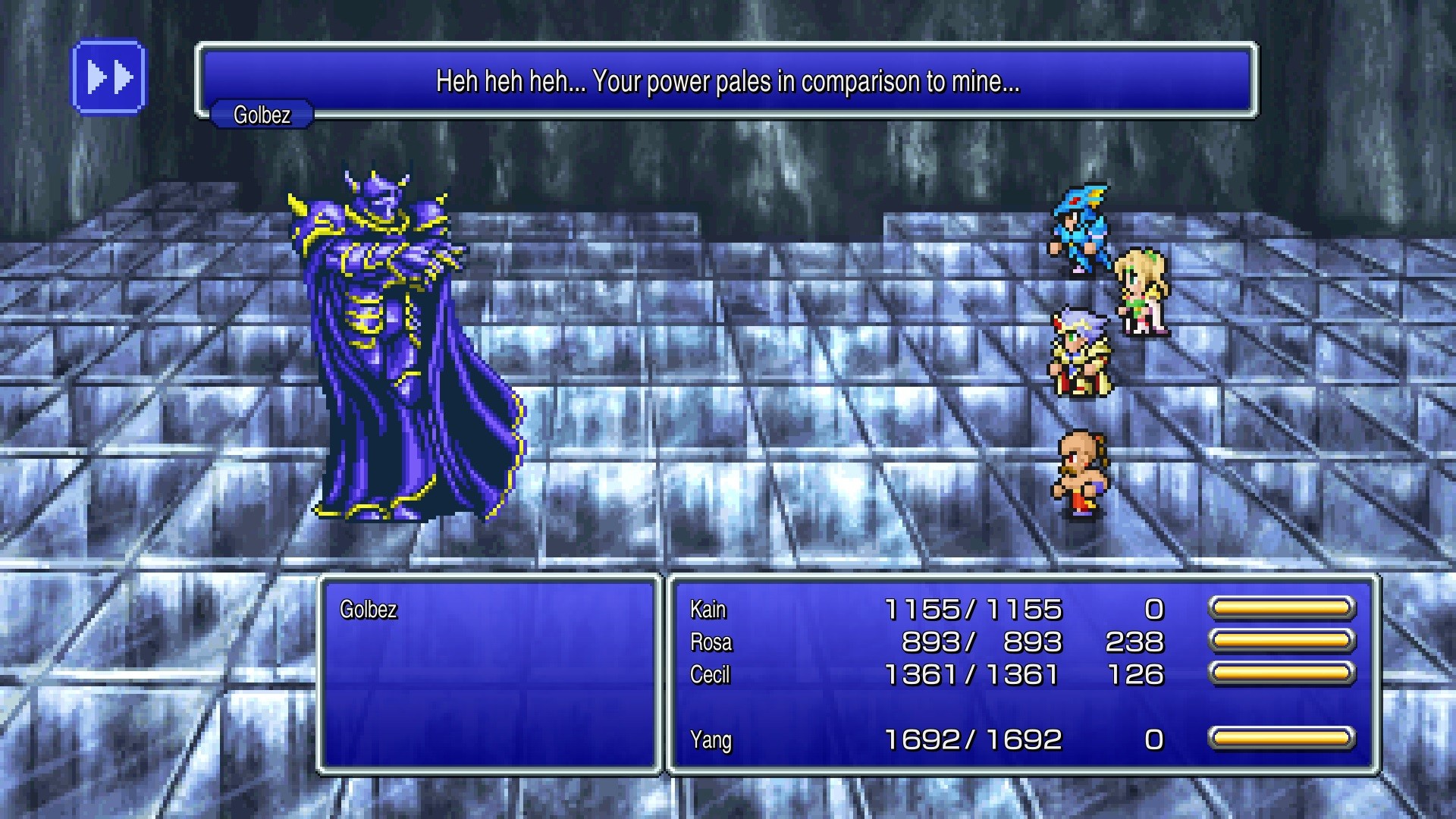
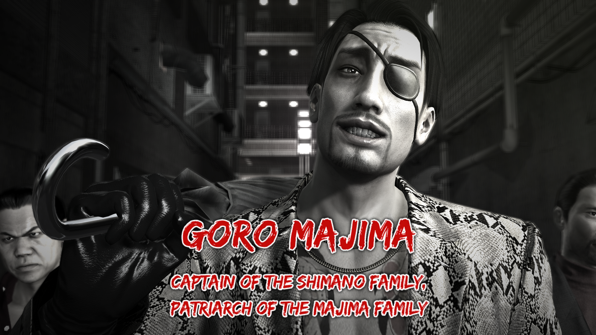
For Sega localization producer Scott Strichart, it's the iconic "Yakuza font" now known for preceding in-game battles and introducing major characters. Strichart gets asked about the strangely ubiquitous font often enough that he's already shared some of its history.
When working on the localization for Yakuza 0, the prequel game that Strichart hoped would be a fresh start for the series in English, part of that vision was going back to using big, localized text for titles and other major moments.
"But what font to use? Well we sure dug into it with creative and legal," Strichart says. "We looked at Yakuza 1 and 2 for inspiration. We looked at other Western/Asian media. We got some looks going. And boy did I greenlight the wrong font for a hot second."
Yikes.
"But I looked at this longer and I was like, oh my god what have I done? It's illegible. Kinda outta options, I looked at the marketing team and I saw the dream," he says. The right font face had already been right in front of everyone's faces.
The Edo SZ font that the marketing team had been using in box art and trailers for years actually looked great in game. "A unified front of marketing materials and in-game fonts! And the rest is history!"
Looking to the Futura
Teams may be relatively free to choose font faces based on aesthetics nowadays, but it wasn't always so simple. Years ago, Strichart says they had to plan for the worst. "You’d ask the developer to fill a text box with Ws—the largest letter—to see what the worst-case scenario for that font would be."
There's always that one person that names their character "WWWWWW," isn't there?
One game Strichart worked on could fit only two lines and 24 characters. "That’s nothing by today’s standards, and at that length, you really have to start chopping out flavor in favor of critical context, which sucks." Yakuza 0, whose localized version first launched in 2017, Strichart says allowed about three lines with 40 characters. "You could practically write a novel by comparison."
Space is no longer the major issue it once was. Now, though, developers are also considering localizing into even more languages like Russian, Arabic, or Chinese. "If you go into adding those languages without someone who speaks them to look at the way your font displays in game, it’s going to be a bad time."
Best of luck to these experts' counterparts sifting through options to find a Chinese or Russian font with just the right balance of personality and legibility.