
How Pentiment's hand-crafted fonts give pen and ink a voice
Every distinct font reveals something about a character's class and education—and can offer you clues to Pentiment's mystery, too.
Talking to Obsidian design director Josh Sawyer forced me into a harsh realization: I have the handwriting of a peasant.
Decades of education and the internet's infinite resources at my fingertips, and yet my messy chicken scratch would fit right in with a 16th century Bavarian peasant's in Pentiment. It's some consolation that Sawyer says his would, too.
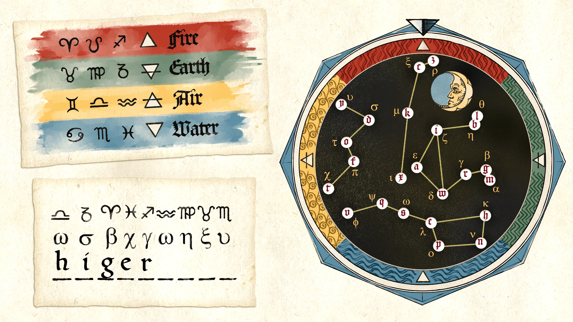
In our defense, the printing press is a bit more established in 2022 than it was in the 16th century, when your writing spoke volumes about your education, social class, and profession. That granularity is why Obsidian partnered with design firm Lettermatic to create six unique fonts for Pentiment, each telling you something about the characters you meet and talk to while trying to solve Pentiment's mysterious murders.
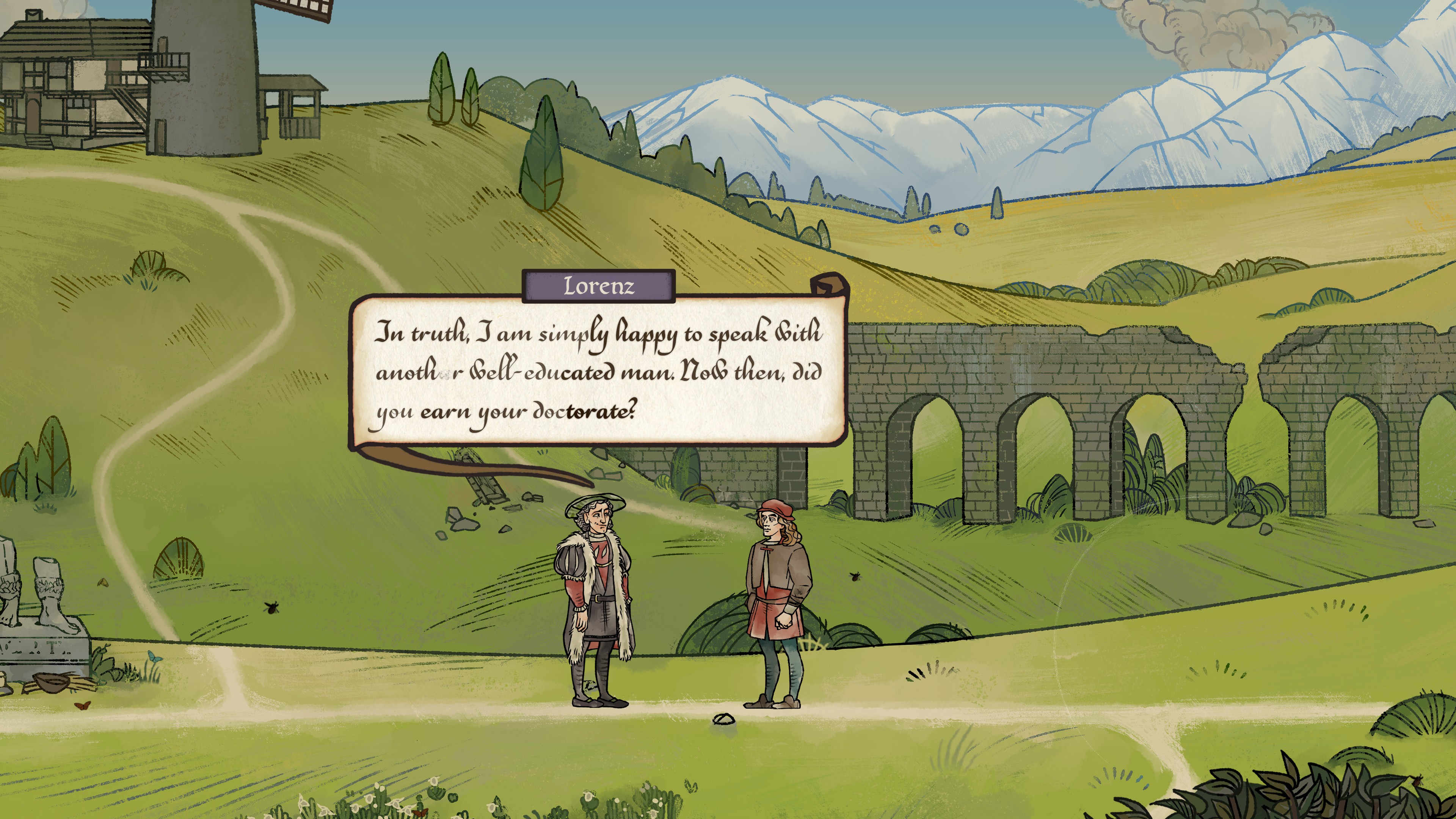
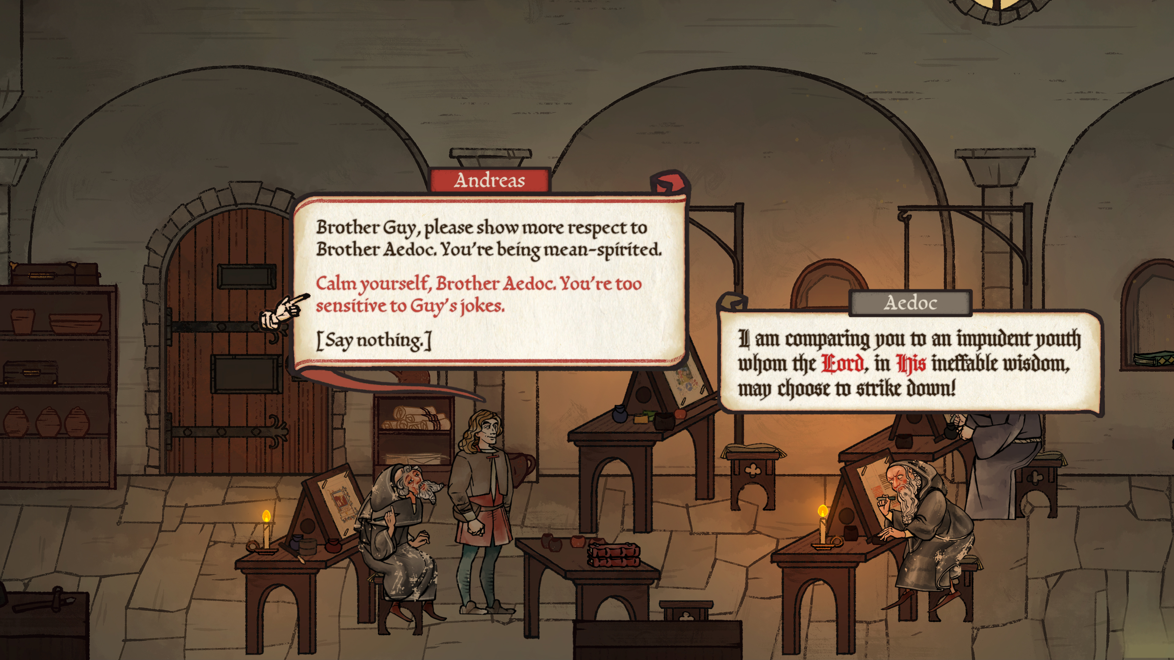
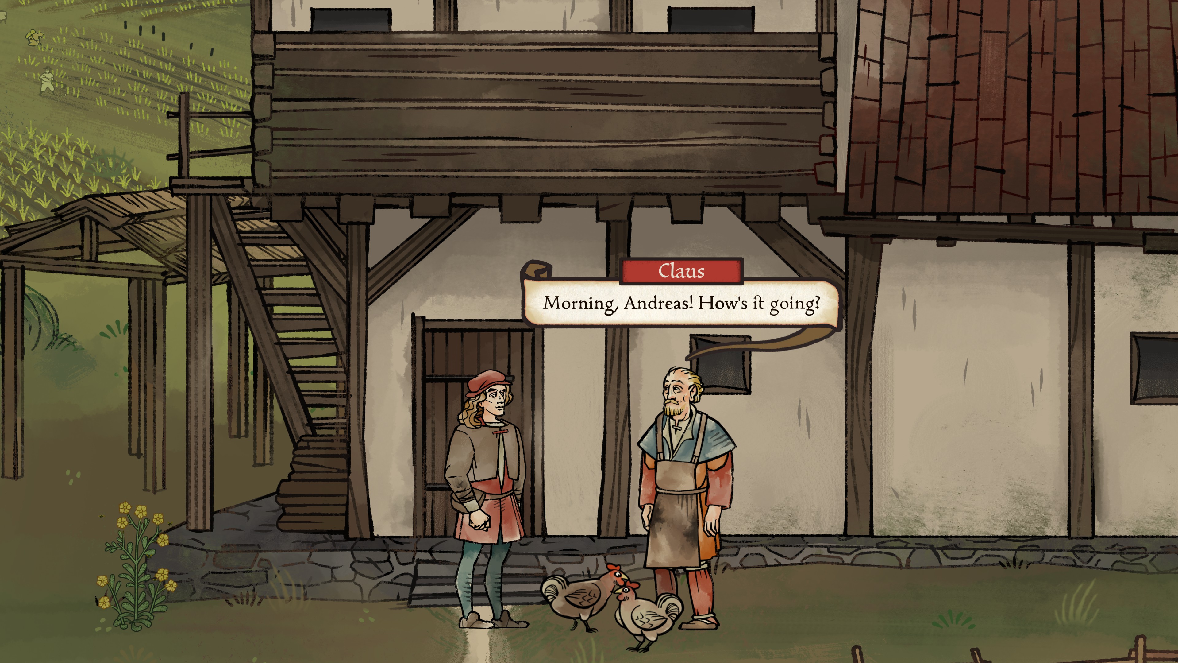
"Handwriting was changing a lot at this time, with different literacy levels," says Sawyer. "So a person who is a peasant and possibly illiterate, or doesn't read or write very well, uses a peasant script. Middle-class people tend to use a more refined cursive script. University-educated people, especially from Italy, use a Humanist script. The older monks, especially if they're associated with the scriptorium, use a Gothic, blackletter font. And then the printers and people who read a lot of printed books use a printed typeface."
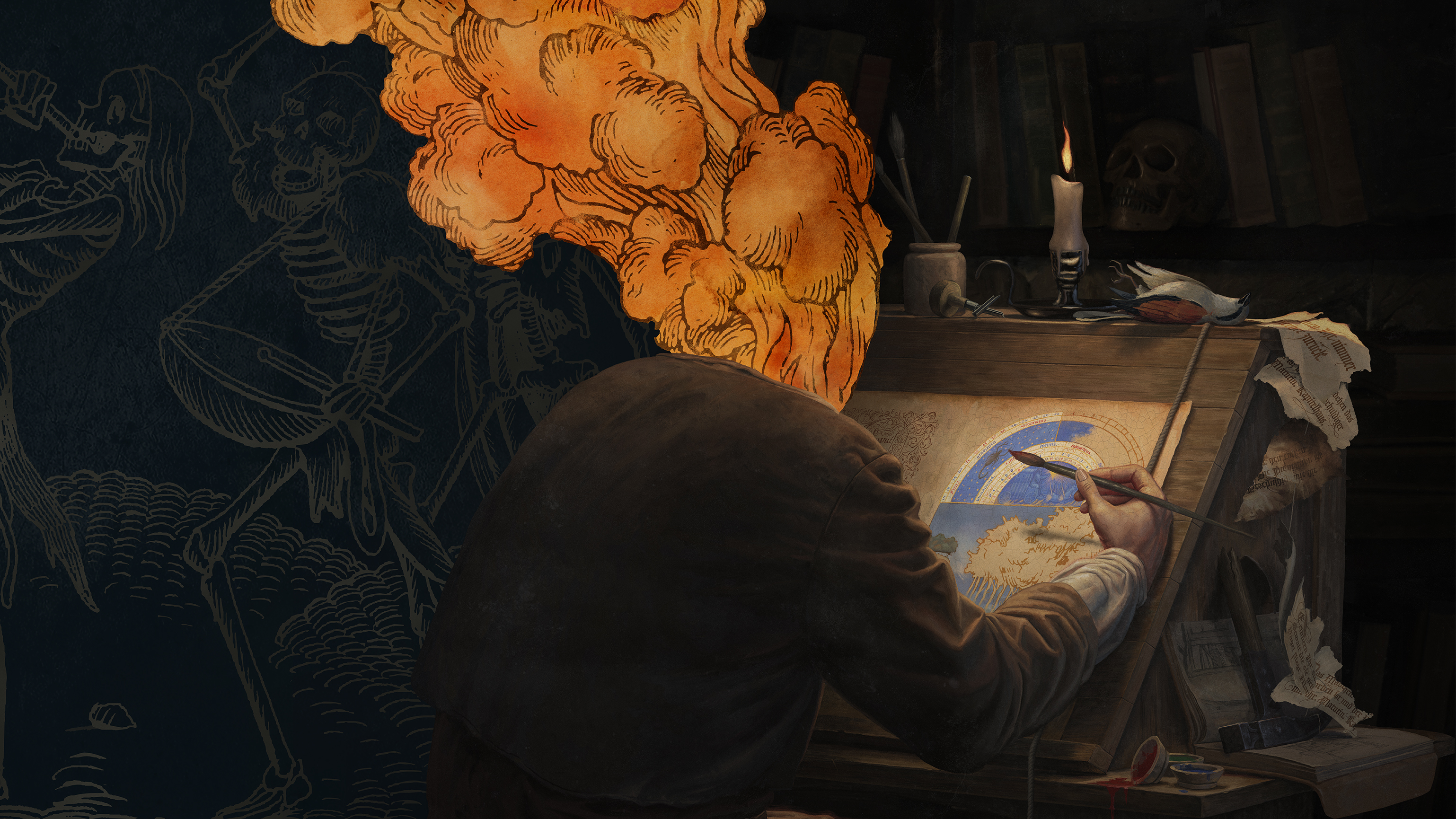
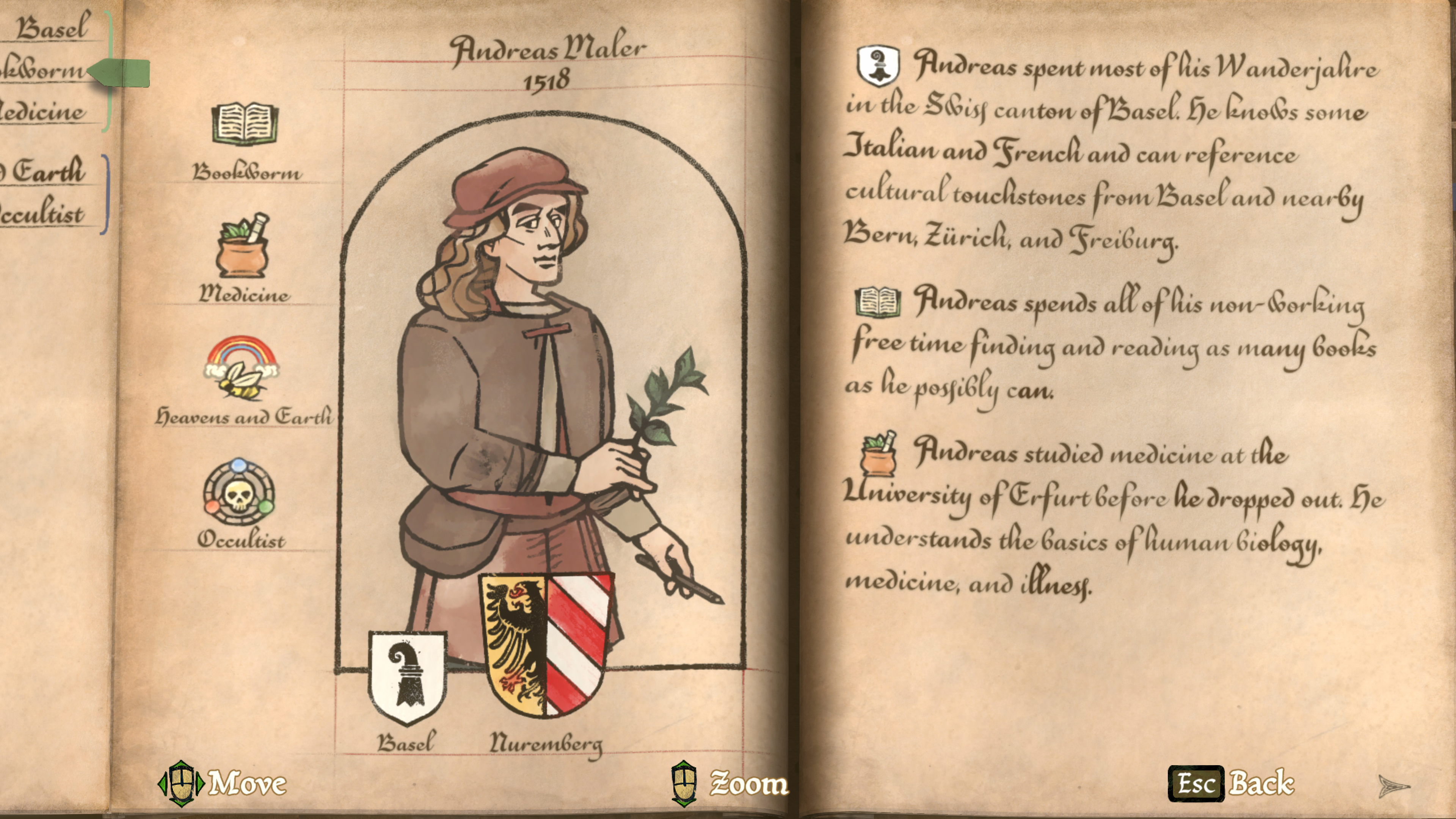
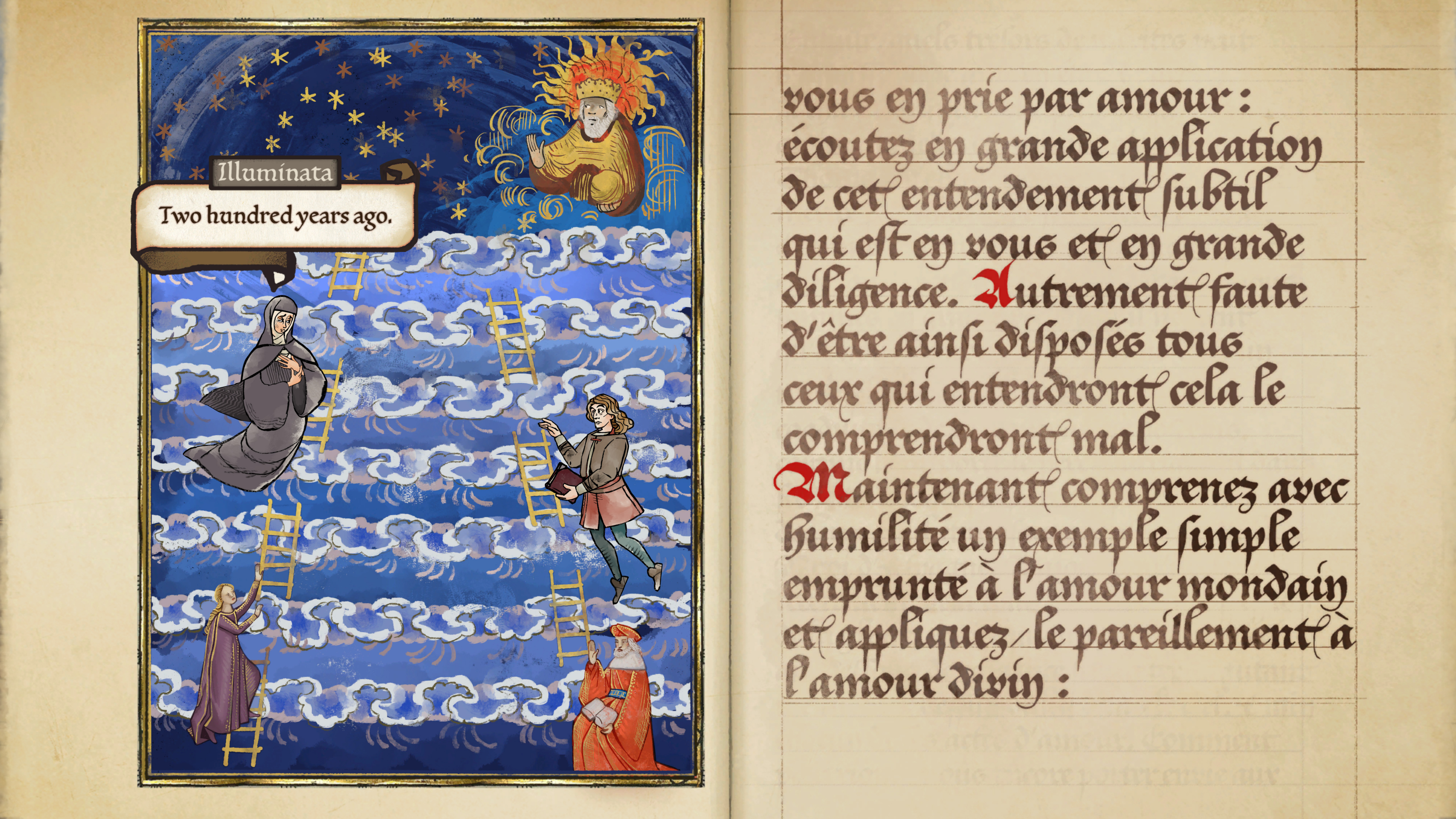
Those distinct typefaces are just the start of Pentiment's font system. In a game largely about art and writing—protagonist Andreas Maler is an artist at an abbey in 1518 when the story begins—it was just as important for the text to feel tangible.
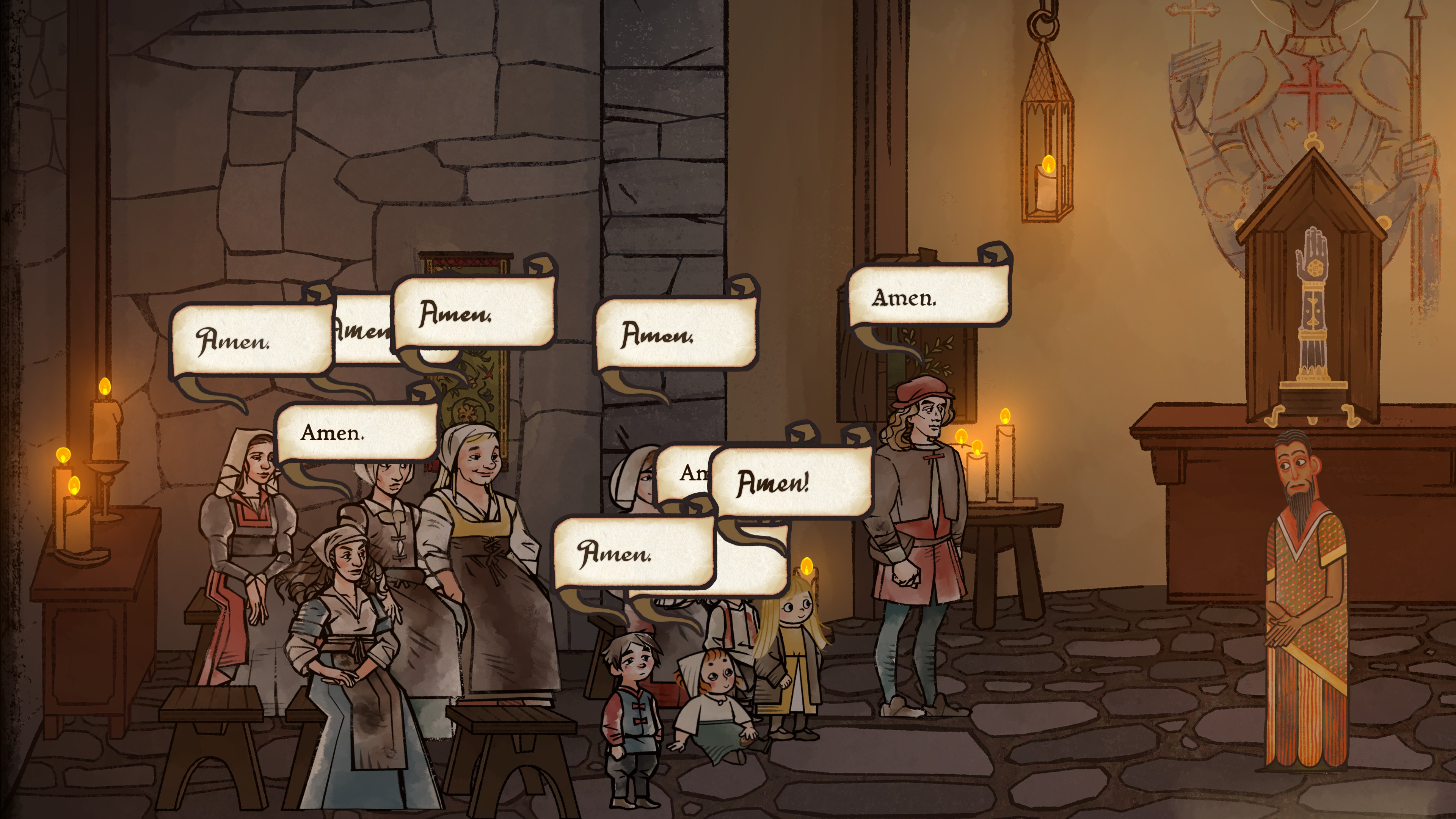
When "handwritten" dialogue appears it starts a dark, shimmering black, then dulls and flattens out like ink. It even bleeds a little, like it's being absorbed into parchment. Well-educated scribes write quickly and make few errors, but less-educated characters will write more slowly, and spelling errors will often appear in their dialogue. Characters who speak in printed letters will have their text appear as upside-down blocks before it's "pressed" into the dialogue bubble.
"I really wanted to capture the feeling of the physicality of writing," Sawyer says. "When you look at how dialogue appears in the game, it doesn't just slap on the page."
One of Pentiment's glyphs proved to be so complex, it literally couldn't fit into a laptop's RAM. "When our producer Alec Frey got to the fanciest font there was a ligature, a capital 'AE,' and it was so elaborate his Surface ran out of memory," says Sawyer. "There were so many strokes in the glyph that it was just ridiculous."
Obsidian even simulated the effect of dipping a pen in ink for the cursive script. "We try to replicate a mechanic that says 'I'm going to run out of ink, and then I'm going to dip again in the ink, and then I'm going to start writing,' says Pentiment programming director Brett Klooster. "You can actually see that process represented in the font as it gets a little bit lighter and a little bit thinner."
I knew that Pentiment was doing far more with its fonts than most games, but I still underestimated how meticulous their creation ended up being. Riley Cran, the founder and lead designer of font firm Lettermatic, told me that Pentiment was a special case. Lettermatic designs most fonts to support a variety of weights and widths (light, bold, etc.), but there are tricks to speed up that process. For Pentiment, "a much, much higher amount of those drawings were created individually. It was someone sitting there actually drawing it by hand," Cran says.
A Pentiment font isn't just 52 glyphs (aka unique versions of a letter, like lowercase and capital). To replicate real handwriting, many letters need to be drawn in multiple ways to reflect where they appear in a word, or to add subtle differences between the writing styles of different characters. Creating those minute variations just wasn't going to work digitally.
"If you want to have two letter 'As' that don't match in the sense that they look like someone's hand drifted ever so slightly when creating one of those strokes, drawing that digitally is going to fight you more than help you. So that's why we had to do this analog process," Cran says. Lettermatic drew the fonts on paper and then scanned them digitally to capture the effects of pen on paper.
Each hand-drawn glyph was then supplied to Obsidian, along with a "ductus diagram" that explains how each letter was formed: how many strokes comprise a letter, the order those strokes are made, even what direction the pen is moving. That may sound absurdly detailed, but think about a letter as simple as a lowercase 't'. How do you write it? Do you start the vertical line from the top or bottom? Do you draw the horizontal stroke from the left or the right? Which comes first?
That was vital information for Obsidian's designers. They created "stroke masks" for each glyph, which allowed dialogue to appear not just one letter at a time, but stroke-by-stroke. After attempting to automate that process, they eventually went with what Sawyer calls the "John Henry" approach. "We literally just stroked every single character manually," he says.
There ended up being 2016 of them. "Every single letter for the five non-printed fonts, every single letter had all of its strokes hand-masked, so that when you see them drawn out in-game, they come in in the correct order. Which is crazy, but it looks cool."
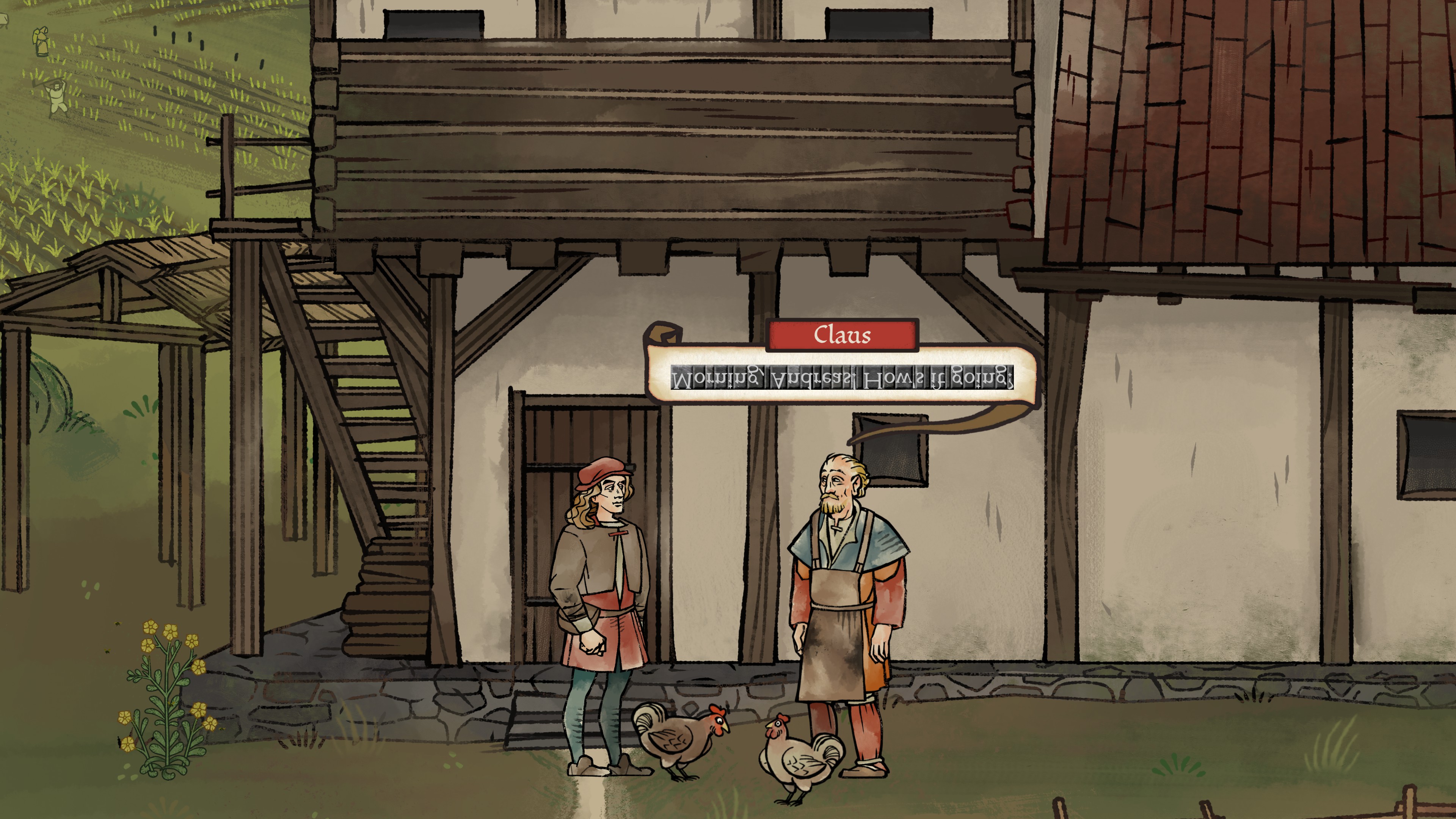
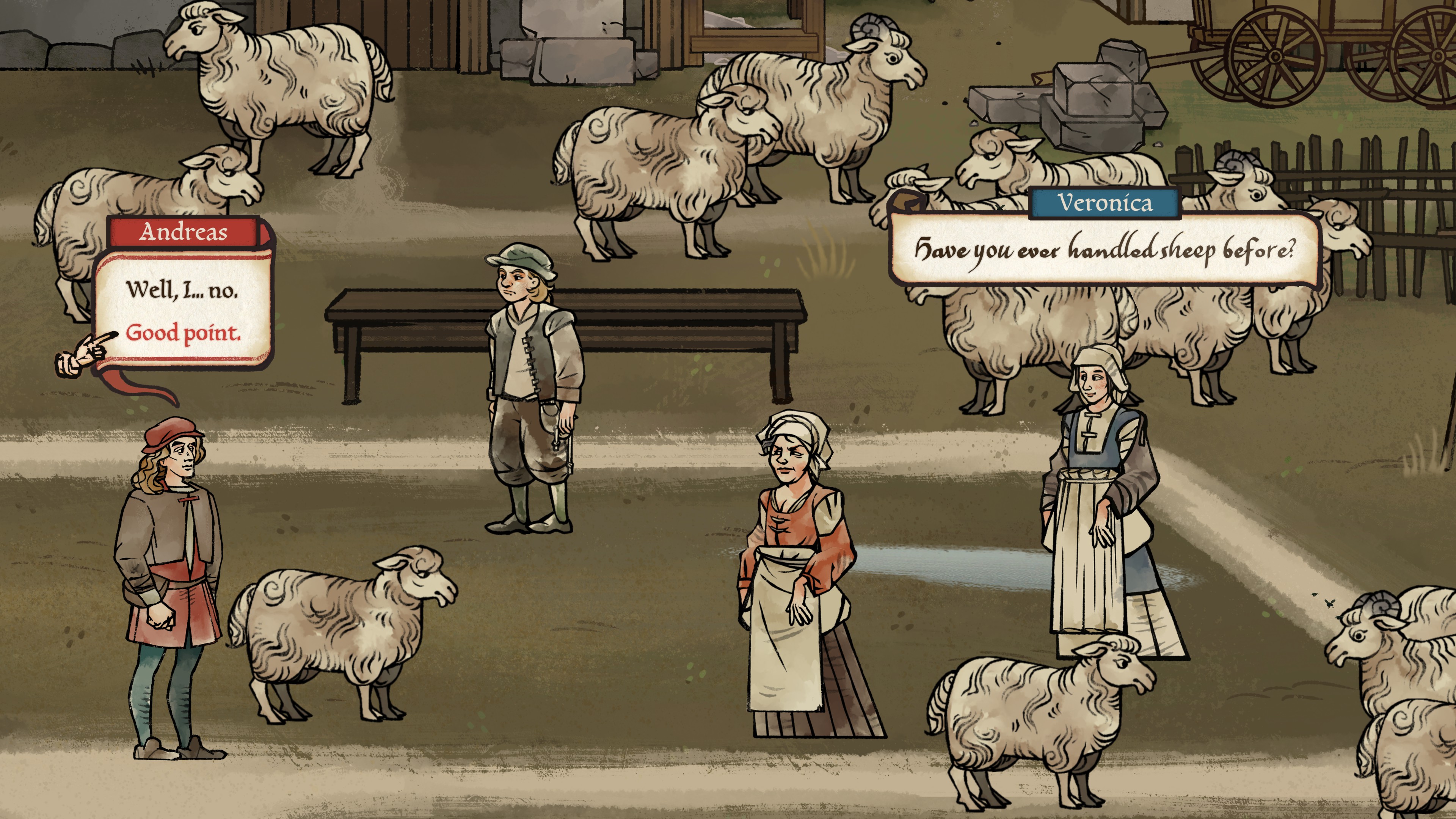
Pentiment's fonts are vital texture, but they also provide clues about the characters you're talking to—a scribe who makes lots of errors, for example, could actually be an impostor. As Andreas learns more about someone's background, their writing style can change fonts. But the fonts are only ever offering redundant information, in case you choose to play with Pentiment's more accessible easy reading mode.
It wouldn't be a Josh Sawyer game without an optional hard mode, too. This one turns on historical characters like the "long s" that looks like a cursive "f," and some ligatures that connect letters together with some extra flourish.
"We joked about having a hardcore mode where every ſingle thing in the game iſ written in the fancieſt font, which iſ probably too nutſ," Sawyer laughſ.